Branding & Corporate Design · 2025
SCHOBER AUTOMATEN
CORPORATE DESIGN · VENDING
Logo and corporate design for SchoberAutomaten, a specialist dealer for modern vending systems: a gear with a warm swoosh, a bold wordmark and a palette of blue, cyan, orange and yellow.
- Client
- SchoberAutomaten GmbH
- Category
- Branding & Corporate Design
- Year
- 2025
- Services
- Logo designCorporate designColor and type systemLogo animationTrailer
Logo
In motion
Logo Animation
Trailer
Colors
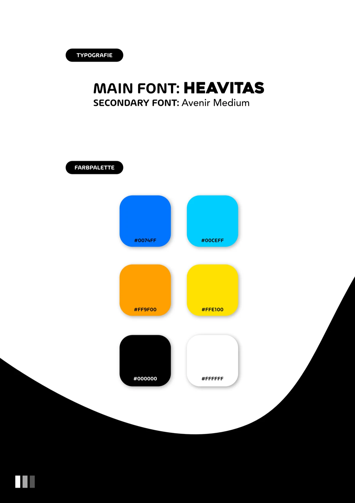
Blue
#0074FF
Cyan
#00CEFF
Orange
#FF9F00
Yellow
#FFE100
Black
#000000
White
#FFFFFF
Typography
Heavitas
Main typeface for headlines
Avenir Medium
Secondary typeface for body copy
The brief
SchoberAutomaten plans, delivers and services vending machines for kiosks, farm shops, petrol stations, hotels and leisure venues. The brand has to say two things at once: there is solid engineering behind it, and buying from the machine is easy. And it has to work large and small, on white as well as on black.
Our approach
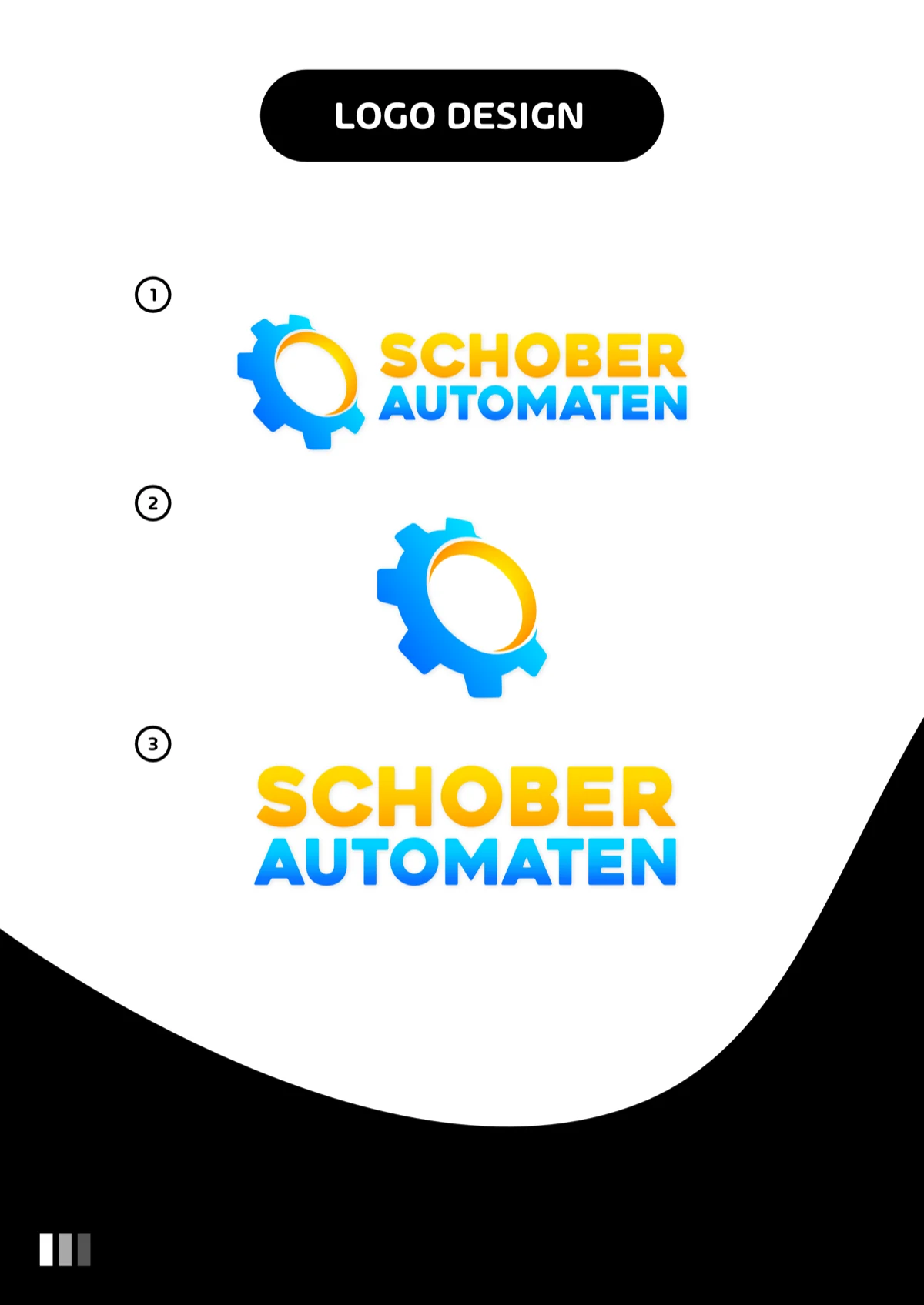
The gear stands for engineering and mechanics, the yellow and orange swoosh at its center for motion and energy. In the wordmark, SCHOBER sits in warm yellow above AUTOMATEN in cool blue, so both gradients carry the name as well. Heavitas sets the headlines, Avenir Medium the body copy. On top come three logo versions, combination mark, icon and wordmark, and a short vertical logo animation for social media.
The result
A CI overview with logo, typefaces and colors, plus the logo files in every version, transparent and on white. The logo is in use on the SchoberAutomaten website today and gives the dealer an identity of its own next to the manufacturers whose machines it sells. Plus a 30-second vertical trailer that closes with the logo animation over the footage.
The brand in use

3
Logo versions: combination mark, icon, wordmark
6
Colors in the CI palette
2
Typefaces: Heavitas and Avenir
Next project